The geography of social mobility
15th December 2017
 Yesterday’s DfE report Unlocking Talent, Fulfilling Potential: a plan for improving social mobility through education put a strong emphasis on ‘place’, recognising that how young people ‘get on’ in life cannot easily be separated from the areas in which they grow up. I’ve blogged before, here and here, on the strong links between young people’s outcomes and the neighbourhoods they grow up in. Here, we’ve conducted new analysis on fresh data from UCAS to move the debate further.
‘Place’ and social mobility
Justine Greening promised that this week’s new social mobility strategy would be responsive to the context of local communities, and this is welcome. But aspects of ‘place’ – such as young people often being fiercely attached to their neighbourhood – make simplistic narratives of ‘social mobility’, and their expectation that young people can easily uproot themselves to capitalise on opportunities, quite problematic. I’ve argued so before here.
Even so, if ‘place’ is to be at the heart of our new social mobility strategy, we can do worse than try to develop a nuanced understanding of the types of places where young people’s outcomes fall short of their peers. This week UCAS released data from its 2017 End of Cycle Report which shows the entry rate to higher education (HE) of 18 year olds by parliamentary constituency. Constituencies cover mid-sized areas (compared to the small units of the POLAR classification and larger units like regions), and this makes them a handy geography for picking out geographical ‘hot spots’ and ‘cold spots’ in young people’s outcomes. As we’ve argued elsewhere, constituency-level data are also a useful tool when trying to mobilise political will behind a policy problem.
What do the data show?
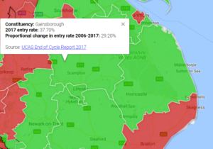
Looking across all constituencies, there is a wide spread of HE entry rates, from the lowest (Glasgow North East, 19%) to the highest (Wimbledon, 81%). The largest increases in entry rates over the last decade appear to be in core metropolitan areas like Glasgow, Leeds, Manchester and Birmingham. In the capital, East London appears to have experienced the largest increase in entry rates.
Full map here
Beyond picking out the entry rates in individual constituencies, one way of looking for broader patterns is to categorise constituencies into ‘types’. When we do this based on the urban/rural mix in each constituency, we see that a particular set of constituencies (classified as ‘urban with minor conurbations’) have the lowest entry rate, on average – 35% compared to 42% across all constituencies.
If we give these ‘low participation’ constituencies a black border we can see they lie in a tightly focused cluster between Derby and Nottingham, and between Sheffield, Barnsley and Doncaster.
full map here
These aren’t necessarily the individual constituencies with the lowest entry rates – they’re shown in red on the map, with notable clusters of low participation in the Thames Estuary, East Anglia, the South Wales Valleys and the Central Belt of Scotland. However, as far as there are types of constituency that seem to send relatively few young people on to higher education, there appears to be a distinct cluster of former mining areas in the centre of England.
Why might these areas be significant?
Young people growing up in inner-urban areas of large cities tend to face the highest levels of deprivation. However, inner-urban areas also give young people access to a range of amenities, host a wide mix of people and jobs, and have historically tended to receive the most policy focus – from regeneration programmes to teacher recruitment schemes. It appears that young people might face particular challenges growing up in smaller urban areas: the outskirts of cities, smaller towns, or the places where one conurbation ends and another begins. It might therefore be worth policy makers, Widening Participation initiatives and, perhaps, social mobility strategies, focusing more on these types of area in the future.
