
Accountability Reformed: The case for multi-year measures
29th November 2019
Professor John Jerrim (UCL Institute of Education) and Loic Menzies (The Centre for Education and Youth)
School league tables produced every year by the Department for Education currently only use a single year of test score data in the headline measure. This means schools get labelled with terms such as “above” and “below” average based solely on their most recent cohort of Year 11’s.
This is not a smart thing to do.
It would be much better to use the average performance of a school across multiple years.
This blog first recaps the reasons why – and then suggests how it could be done.
Why is data from a single year problematic?
The Centre for Education and Youth’s election manifesto called for multi-year averages for three main reasons, based on CfEY’s 2017 report “Testing the Water”:
- To provide a more reliable and valid picture of performance
- To offer school leaders respite from ultra-stakes, short term accountability
- To reduce teacher workload and pupil stress.
1. A more meaningful measure
In a single GCSE cohort, a secondary school can have fewer than 100 pupils.
In primary schools, the numbers are much smaller still.
This is not a lot of data to be basing important judgements upon. On top of that, although the correlation between Progress 8 measures across two adjacent years is quite high (around 0.9), there will always be outliers where a school has had an academically weaker cohort due simply to chance.
Yet a single bad year of performance data has big important consequences for teachers and schools, and this is terrible news for parents who count on the government to provide them with reliable information about local schools.
At a basic level, a three-year average means the sample size for each school increases; the ‘signal’ from the data improves and the ‘noise’ is reduced. This, in turn, means we have more certainty in the results – and can provide better information to the users of school data including parents who are choosing a school for their child.
A single bad year of performance data has big important consequences for teachers and schools, and this is terrible news for parents. But it doesn't have to be this way Share on X2. Respite for school leaders
A football manager culture has developed in schools, with Heads made or broken by a single set of results. This is in no-one’s interest and makes the job unappealing and soul-destroying for many.
The football manager culture for head teachers in which they are made or broken by a single set of results is in no-one's interest Share on X3. Reduced teacher and pupil workload and stress
Pressure on school leaders to prove their worth with a single year’s results is frequently passed on to teachers of exam groups and, in turn, their pupils.
Official recognition that improving school results is more of long game will discourage hot-housing of single year groups and encourage a more long term approach – something parents, teachers and pupils have been crying out for.
How could this actually be done? An illustration
Since publishing Testing the Water, extensive discussions about the three-year average idea have thrown up remarkably few objections with the two predominant ones being.
- Is it possible?
- Is there a risk of not spotting a school in rapid decline?
This blog is intended to rebut both these objections.
How do we actually go about using data from multiple years?
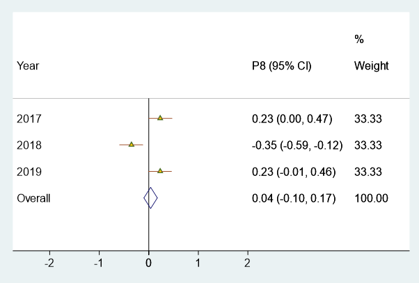
Let’s take three years of Progress 8 data from the Jubilee High School (URN = 139948). The school suffered from exactly the problem described above: it had a single difficult year in 2017/2018 (P8 score of -0.35), but did much better in 2016/17 and 2018/19 (P8 scores of 0.23 in both).
What then is the best way to present this data to make the true performance of the school clear?
Figure 1 presents results from a statistical technique known as a meta-analysis. It is normally used to summarise results from across multiple studies investigating the impact of an intervention, in order to produce our best estimate of its effect. This is basically the methodology underpinning the Education Endowment Foundation’s toolkit.
Yet this technique can also be used to combine the information we have about schools from across multiple years – as shown in Figure 1. This presents the Progress 8 results of this school in a “Forest Plot”, neatly illustrating the trend in its P8 scores over time. Importantly, at the bottom it also provides our best guess of the overall performance of the school, combining together information from across all three years.
The outlying year (2018) has some impact upon the overall result; but does not completely overwhelm it. This is fair, given its much stronger performance in the previous and subsequent year. It is also a better reflection of the progress typically made by pupils in the school.
Our proposal is that, from next year, this becomes the headline measure used in the school performance tables.
Figure 1. Forest plot of the Progress 8 scores for Jubilee High School (URN = 139948)
Why do we believe that this is an improvement over the status quo? Quite a few advantages spring to mind.
First, the Forest Plot in Figure 1 clearly demonstrates where there has been a single “dodgy” year for a school in a trend of otherwise stellar results.
Second, the fact we are now relying upon a multi-year average means that this below-bar year has some impact – but does not swamp – the headline measure of performance of the school. As should be the case for football managers, having several successful seasons in a row should buy a manager more time before they get the sack (though it seems that Daniel Levy at Tottenham may disagree)……
Finally, as we are now using much more data – and have a much larger sample size – the confidence interval accompanying our headline P8 result is much smaller. In other words, our headline measure provides more accurate information which is great news for parents as well as policy makers trying to understand school performance.
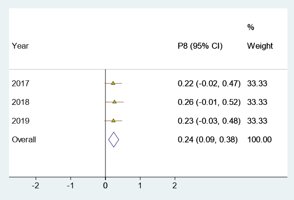
Figure 2 helps to illustrate this final point by drawing upon data for another school (Looe Community Academy). The Progress 8 score of this school has been very stable over time: 0.22 in 2016/17, 0.26 in 2017/18 and 0.23 in 2018/19. But, as in each year its P8 lower confidence interval has always (just) crossed 0, it has consistently been labelled as “average” by the Department for Education.
Yet this is simply a result of only looking at one year of data at a time!
By combining information across the three years, we can say with more confidence that this school is indeed above average. This is reflected by the narrower confidence interval for our suggested headline measure (the three-year average effect) – which no longer crosses zero. (In our preferred headline measure, the P8 result for this school would be reported as 0.24 with a confidence interval of 0.09 to 0.38).
Thus, using our measure, Looe Community Academy would correctly be labelled as an “above average” school. Whilst we have focused on secondary progress measures in this blog, we would anticipate this benefit being even greater at primary school level.
Figure 2. Forest plot of the Progress 8 scores for Looe Community Academy (URN = 137839)
Spotting issues before it’s too late
During conversations about three year averages with policy makers and civil servants in recent years, the most common objection to our proposed approach has been that the DfE needs to be able to spot any dramatic shifts before it’s too late. The reply is, of course that there’s nothing to stop them looking at the information internally, with due sensitivity to its provisional nature and unreliability. But it need not be a headline, public measure that ends up emblazoned on every newspaper’s front page.
However, an added advantage of our proposed approach is that we can decide the contribution each academic year makes to the result.
In the examples above, each year was given equal weight – it was a simple three-year average.
But perhaps more recent results should be given more prominence to the headline measure than results from previous years. After all, the most recent year of data may be a better predictor of future performance than slightly older data.
Figure 3 therefore provides the results for Jubilee High School again. But now we give more weight (50%) to the latest year (2018/19), 30% weight to the data from 2017/18 and 20% weight to that from 2016/2017.
Figure 3. Forest plot of the Progress 8 scores for Jubilee High School (URN = 139948) with differential weights
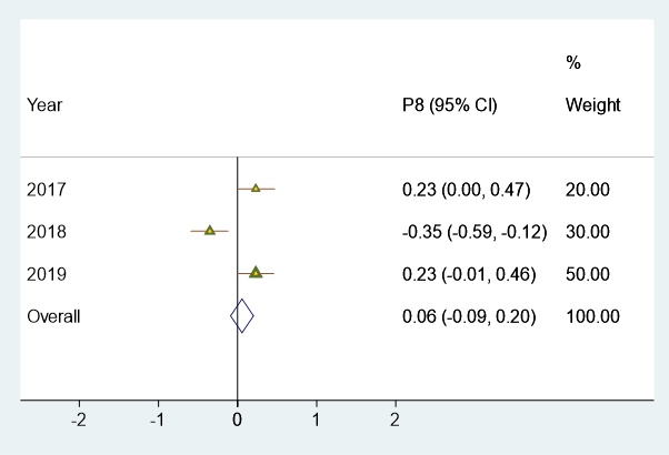
The weights assigned to each year are somewhat arbitrary and open to debate. But the key point here is that we can use data from multiple years in different ways – based upon what various stakeholders (schools, unions, teachers, parents, students, government) feel is most appropriate.
Another way of thinking about this point is that the DfE currently gives the most recent year 100% weight in their headline school performance measures. All other information from previous years is given no weight at all – it is ignored.
There is simply no way this approach makes sense.
The question the DfE must now ask themselves is how an approach that not only lacks reliability, but also drives some of the most pernicious problems in our education system, can possibly be justified any longer…
The DfE currently gives the most recent year of a school's data 100% weight in their headline school performance measures. There is simply no way this approach makes sense. Share on X
Comments